Emails today need to capture attention quickly. Your emails must work even harder to encourage readers to take action.
Email timers add a sense of urgency to your messages. Get it right and that urgency will lead to more sales, sign-ups and inquiries.
In this article, you’ll learn how timers in emails work and how to implement them. You’ll also discover seven of the most effective ways to use countdown timers in your content, with examples from real brands.
What is an email timer?
An email timer is an animated image within an email message that counts down to a specific date or time.
Sometimes called an email countdown timer, it’s typically a GIF (graphics interchange format) file that accompanies other assets, like text or imagery.
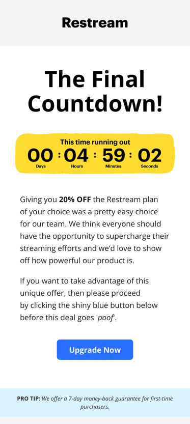
Restream uses a countdown timer in the example below to emphasize that “time is running out” on its discount promotion.
While highlighting the end of a promotional email campaign is common, brands can also use email timers to prepare prospects for:
Event tickets going on sale
Impending price changes
Upcoming product launches
Competition entry deadlines
Account closures
Holiday shipping deadlines
We’ll explore these applications and more with real examples later in the article.
How do email timers enhance sales and marketing campaigns?
Although it’s visually very simple, an image of a counting-down clock represents a shrinking window of opportunity. It tells the recipient “if you don’t act soon, you’ll miss out”.
Many buyers struggle to resist that fear of missing out (FOMO). It’s tied to the psychological concept of regret aversion – when someone makes a decision (e.g. buying a product when it’s discounted) to avoid regretting an alternative decision (e.g. not buying the product and later having to pay full price) in the future.
Buying isn’t the only action you can inspire. You can also use timers in your email campaigns to encourage recipients to:
Register interest
Sign up for a newsletter
Get in touch
Your success will depend as much on the content around your timer as the timer itself. That’s what determines whether the recipient acts and what action they take.
For example, in the earlier image, Restream uses persuasive language like:
“Everyone should have the opportunity to supercharge their streaming efforts”
“We’d love to show off how powerful our product is”
“If you want to take advantage of this unique offer”
“Proceed by clicking the shiny blue button below before this deal goes ‘poof’”
It’s clear that Restream wants the recipient to upgrade to a new plan. It pitches the 20% discount as a “unique” (i.e. personalized) offer to help them make that decision.
Urgency aside, email timers make your content more engaging by breaking up static text. That creates a dual-readership path, which means your content is easily navigable for both:
Analytical readers who read text from start to finish
Scanners and skimmers who head straight for something that catches their eye
How to add countdown timers to your marketing emails: 5 simple steps
Implementing email countdown timers is easy, although the exact method will vary slightly depending on your tools.
The steps below run through the broader process, starting with tool selection.
Step 1: Choose an email countdown tool
You can create your countdown timer using HTML code (HyperText Markup Language) but it’s faster and easier to use an existing tool.
These tools simplify the building process and then provide embed codes (or code snippets) to copy and paste into your email template.
The best solutions offer plenty of customization options, allowing you to create designs that fit your brand and message.
Aim for a tool that will enable you to tweak:
Fonts
Text sizes
Branding
Background images
Text and background colors
Animation styles
Tools to consider include:
ActiveDEMAND. All-in-one marketing automation software ActiveDEMAND integrates with Pipedrive and other sales and marketing tools. Adding countdown timers to emails is one of many things you can achieve with ActiveDEMAND.
Sendtric. There’s a free option or you can unlock more power for $9-49 per month. Sendtric offers plenty of customizability and real-time editing, so you can tweak countdown clocks even after sending them.
CountdownMail. Connectivity with other email clients means CountdownMail will slot nicely into most tech stacks. Useful integrations include Gmail and Outlook.
MotionMail. With many clients known for great marketing, such as Spotify, Wendy’s and Crocs, MotionMail is a trusted name in dynamic timers.
Depending on your chosen software, you may have to pay for full functionality. If this is your first time experimenting with email countdown timers, you can use a limited free plan or trial to get a feel for what’s possible.
Step 2: Select your countdown timer format
There are various types of countdown timers, each with different behaviors. Choose yours based on what you’re counting down to.
The classic styles are as follows.
Date-based countdown timer
If you’re counting down to a big sales event, like a product launch or Black Friday, all countdown timers should read the same, regardless of the recipient, location or time zone. You’ll achieve that with a standard date-based countdown timer.
Evergreen countdown timer
An option for when each recipient needs their own unique countdown timer, this is ideal for user-specific offers, trial expirations and following up on abandoned carts (e.g. “you have [x] hours until your unpurchased items will be deleted – act now!”). Evergreen timers typically start when you send the email or the recipient opens it.
Dynamic countdown timer
Dynamic timers display differently depending on the recipient. Use these for promotions where sections of your audience have unique deadlines. That could be due to their account status (e.g. silver vs. gold members) or region.
Step 3: Set your deadline
Planned announcements, trial expirations and product launches come with their own deadlines.
Simply enter the appropriate period of time into your app and keep working through its tutorial.
If you don’t have a deadline, think about what you want to accomplish with your campaign.
For example, if sales for your e-commerce business dip in the middle of each month, you could run a flash sale to entice existing customers back. In this case, 24 or 48 hours is sensible.
For bigger promotions, you might set a month-long timer and include it in reminders you send throughout the campaign. That’ll gradually create urgency over a longer period.
Step 4: Customize it
Choose fonts, colors and other elements that will help your timer blend with the rest of your email design.
Fonts
If you’re using a standardized font for your email’s body text or headers (like Arial or Times New Roman), you may find your timer has the same option. If so, choose that for fast results.
Otherwise, some tools (CountdownMail, for example) allow you to upload custom fonts.
Colors
The apps we listed earlier have plenty of color options, so it should be easy to create a timer that complements your branding.
You can also choose colors that fit with certain themes. Red works well for Christmas promotions, while orange text on a black background is ideal for Halloween events.
Logos
Bear in mind that most free tools will leave their own logo or watermark on your design. That might appear unprofessional to your audience or even confuse them about who’s sent the email.
With a paid plan, you should have the option to remove the provider’s logo or upload your own.
Step 5: Paste the code snippet into your template
While you’ve been tweaking and creating your countdown timer, your tool will put the HTML code together in the background.
Here’s what that looks like in Sendtric:
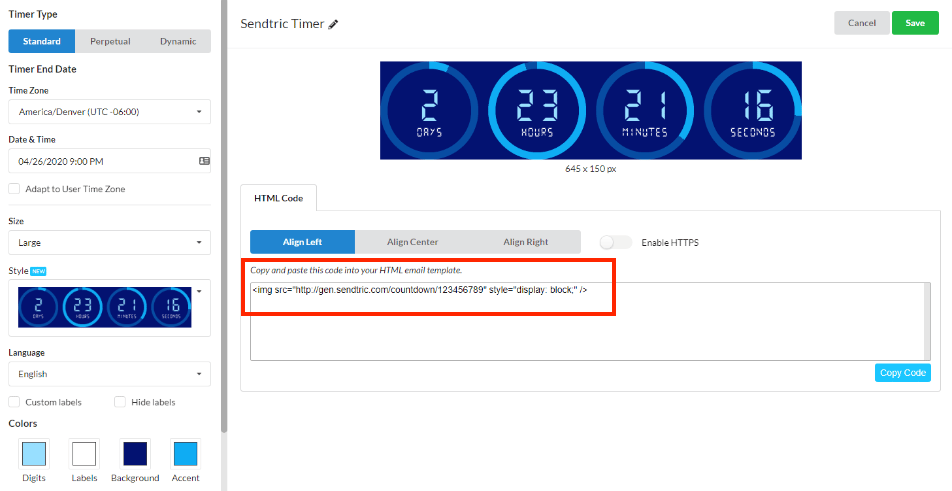
Hit “generate” (or similar) if necessary, copy the snippet and then paste it into the HTML editor of your email marketing software’s design tool.
In Campaigns by Pipedrive, you can add an “HTML block” to your design which contains the timer’s code in a single drag-and-drop asset, speeding up any layout changes.
Once you’ve seen your timer in place, you might want to tweak the font, colors or sizing. Keep both tools open so you can make adjustments quickly.
7 great ways to use an email timer (with examples)
They may look simple, but email timers are incredibly versatile. If you use them at the right moments, they can enhance many different types of campaigns.
One of the best ways to generate ideas for your business is to look at other brands’ efforts. Here are seven powerful use cases for email timers, each with a real-world example for inspiration.
Use case 1: Event tickets (Miro)
Urgency builds naturally as you get closer to any event. Sometimes you need to remind your audience that the opportunity window to get involved is shrinking.
Miro does that well with this subtly designed webinar countdown timer:

Style-wise, Miro’s timer complements the rest of the email perfectly. It’s also conveniently placed next to the call-to-action (CTA) button to entice clicks and improve the campaign’s click-through rate (CTR).
Use case 2: Time-limited offers (MacPaw)
Time-limited offers come to mind fast when you think of email countdowns. A little pressure is often enough to convince a buyer to make a quick decision.
Be honest with your deadlines. If you keep extending offer periods, you risk:
Annoying customers who buy early
Making future email timers less effective
In this example, MacPaw embedded a timer into actionable “challenge” content:
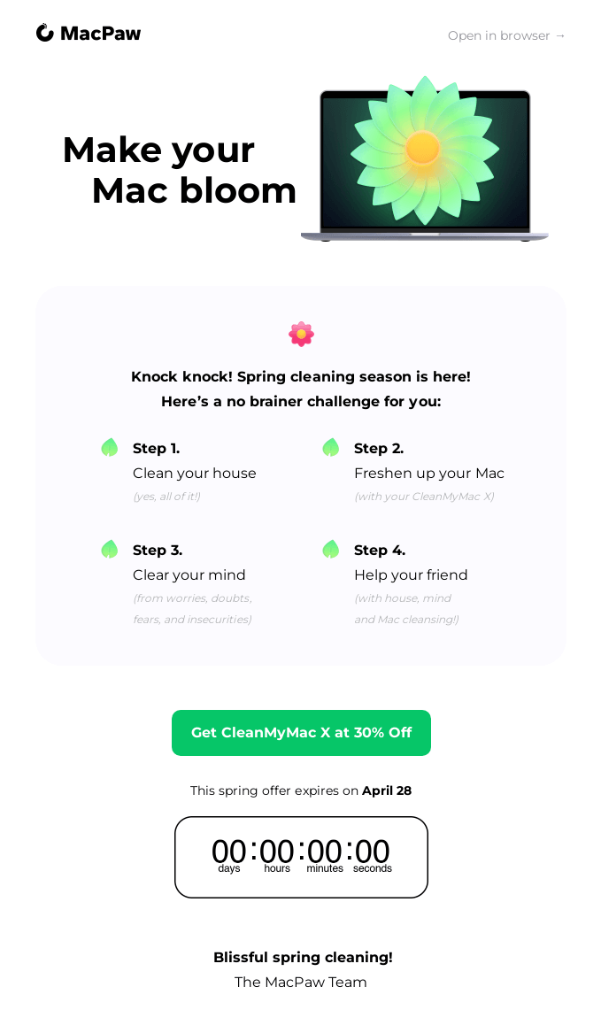
As MacPaw’s example shows, your timer doesn’t have to be your email’s centerpiece.
If your surrounding content is engaging enough, readers will get to the end where the timer acts as a final push toward conversion.
Use case 3: Product launches (Mac)
You can use email timers to build anticipation around new products. Just be careful not to give everything away.
Provide details to excite your target audience but leave enough to their imaginations to create intrigue.
In the example below, cosmetics brand Mac leads with its timer and uses the phrases “something big” and “something major” to pique interest:
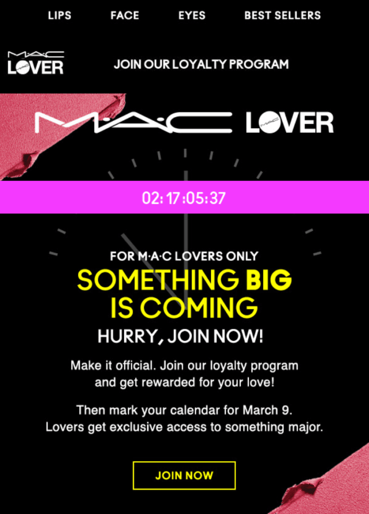
Mac also uses exclusivity to hook recipients. The lines “for Mac lovers only”, “get rewarded for your love” and “lovers get exclusive access” are all designed to make the audience feel special.
Use case 4: Account expiration (Zapier)
The more you prepare users for their accounts to lapse or renew, the more likely they are to make a confident decision about whether to continue with your product.
Zapier makes things very clear with its trial expiry email timer:
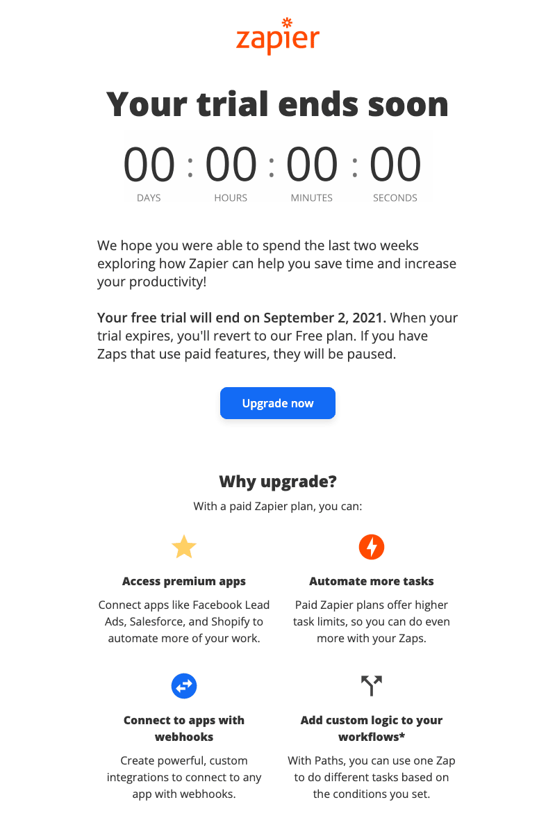
While there’s nothing too personal, Zapier’s mentions of “the last two weeks” and a precise expiry date give a casual and familiar feel. The simple “Why upgrade?” section drives home some key benefits the user will experience with a paid plan.
Use case 5: Competition entry deadlines (AppSumo)
Email timers are great for collecting last-minute competition entries. Use them to put a little pressure on recipients who delayed entering a contest.
AppSumo entices followers with a bold headline (“$1 million”) and a retro countdown clock:
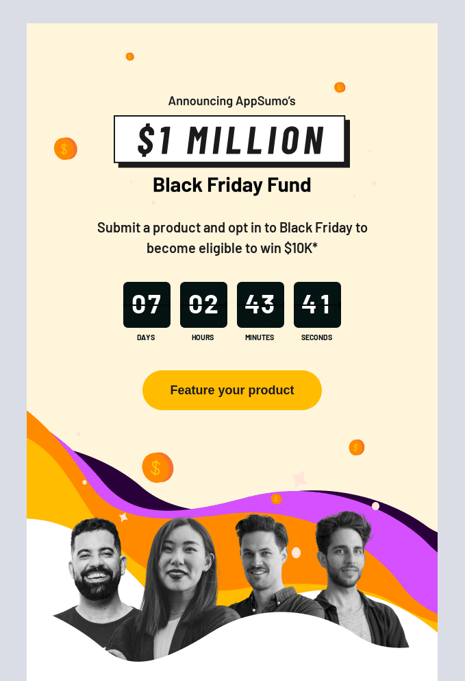
The subject line for this email is similarly persuasive: “Cash in on this opportunity” relies on recipients’ FOMO to entice opens.
Use case 6: Abandoned cart expiry (Forever 21)
Sometimes it only takes a simple nudge to get a lead over the line.
An abandoned cart email timer can catch website visitors who get distracted while making an order. It lets them know they won’t have to restart their journey as long as they return soon.
Forever 21’s abandoned cart reminder is efficient. It talks to recipients in a casual tone (“did you forget something?”), lets them know the clock is ticking and signs off with a snappy CTA (“get ‘em now”):
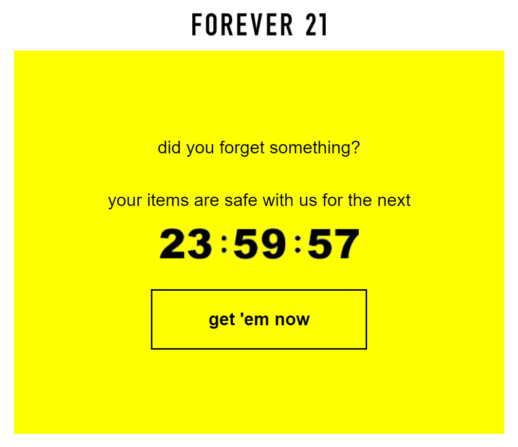
The email is simple, bold, automated content marketing. It creates urgency while showing Forever 21’s interest in helping the reader (“your items are safe with us”).
Use case 7: Holiday shipping deadlines (Harry’s)
An email relaying shipping deadlines can create urgency and prevent customer disappointment.
In this example, Harry’s includes the cut-off point (“Noon EST on December 12th”) in its text but leads with an animated timer:
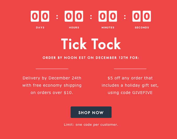
Some readers will open this email, see the timer first (or the phrase “Tick Tock”) and immediately wonder what the deadline means. They’ll then read on to see “free economy shipping” and “$5 off” and hopefully click the “Shop Now” CTA.
Final thoughts
Countdown timers are as versatile and effective as they are simple and cost-efficient. Including them in your campaigns is a no-brainer.
If your surrounding content is direct, relevant and valuable, a timer’s urgency will make your emails more persuasive.
As a result, you’ll see more clicks, landing page visits, interest in your brand and sales. Use the examples in this article for inspiration and test different tools to see what works best for your business.


