If you ever feel like your business and sales data don’t tell the whole story, waterfall charts can help you illustrate the nuance behind the numbers.
Getting to grips with a new data visualization approach might seem daunting, but this article provides everything you need to use waterfall charts confidently.
In this article, you’ll learn what a waterfall chart is, when to use one (and when not to) and how they tell the story behind your sales data.
What is a waterfall chart?
A waterfall chart is a data visualization technique. It shows the positive and negative changes that impact an initial value over time.
Data visualizations produce visual representations of data through graphics such as charts, plots and infographics. It’s all about making data more accessible to see, understand and interpret.
The waterfall chart is a popular chart-based data visualization tool. It’s sometimes called a cascade chart or bridge chart. Other names include the floating column, flying block or “Mario” chart, which is a nod to the flying bricks in the Super Mario video games.
The global consulting firm McKinsey has popularized the technique, so the waterfall chart is also sometimes called the McKinsey chart.
Let’s use a quarterly revenue increase as an example. Over any quarter, several more minor, intermediate changes – positive and negative – happen. Cumulatively, they can impact the outcome.
These factors can include changes like:
An increase in new sales
A decrease in customer churn
An increase in pricing
A decrease in operational costs
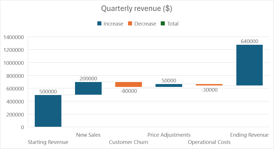
As you can see in the example above, a waterfall chart would visualize these factors as data points, illustrating how they contributed to the change between the starting point and final value.
You could use this insight to inform future investment and sales decisions and communicate results to stakeholders.
When to use a waterfall chart (and when not to)
Every data visualization tool has an ideal use case, and waterfall charts are no different.
Here’s an overview of when to use a waterfall chart and when a different tool might be more appropriate.
When to use a waterfall chart
A waterfall chart may be the correct data visualization to create if the cumulative effect of several positive and negative changes has influenced an outcome.
The approach can be especially helpful in the following circumstances:
When you want to improve your understanding of a particular outcome
When you want better insight into each of the factors that contributed to a result
When you want to share this insight with team members and senior stakeholders in a visual format
Let’s say you run a productivity software company and want to understand how customer retention and acquisition affect your Monthly Active Users (MAUs) over a month.
There are several figures – both positive and negative data – that relate to different aspects of customer retention and acquisition:
New users
User churn
Reactivations
Users acquired through seasonal campaigns
In this scenario, a waterfall chart would be the ideal data visualization. It would show how the incremental changes to these factors contributed to the final MAU figure.
Visualizing the data this way would help you understand which retention and acquisition strategies were most successful in that particular month. It also lets you see how each intermediate value influenced the final outcome.
When not to use a waterfall chart
Waterfall charts can be beneficial in the right circumstances, but there are plenty of scenarios where another type of data visualization is more appropriate.
If your outcome isn’t the cumulative effect of several individual changes, with positive and negative values, then you should consider using another data visualization technique, such as:
A bar chart or column chart
A pie chart
A line chart
A scattergram
Returning to our example of the productivity software company, let’s imagine you want to understand how quarterly revenue is distributed across several monetized product features.
In this scenario, you’re not interested in how the revenue has changed over time, so a waterfall chart wouldn’t be suitable.
Instead, you want to understand the relative revenue share of each feature. A pie chart is the ideal type of data visualization to create because it shows how much each feature contributed to your quarterly revenue.
Download Your Guide to Sales Performance Measurement
How to use a waterfall chart in sales
You can use waterfall charts to support various strategic and tactical sales activities.
Here are some of the most effective ways to use the approach in sales.
Visualizing your sales pipeline
A waterfall chart illustrates the changes that occur over time at each stage of your sales pipeline.
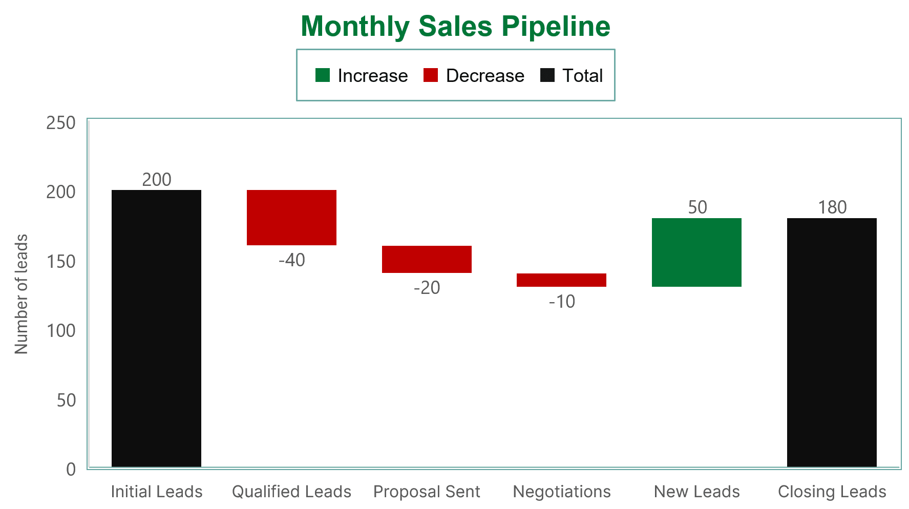
Visualizing your sales pipeline like this can help you keep your team on track and communicate tactical plans to senior stakeholders.
Download our sales pipeline course e-book
Conducting sales analysis
Waterfall charts can help you analyze sales metrics to improve outcomes and drive team performance.
Examples include:
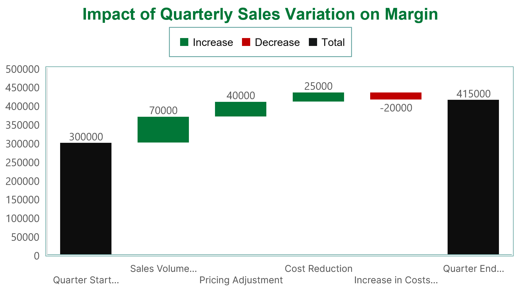
The relationship between sales and margins. Illustrate the impact of changes in factors such as sales volume, pricing and costs on overall margins.
Variances in sales figures across different time periods. Identify seasonal trends and other patterns that might influence sales outcomes.
Sales performance against benchmarks. Identify performance highs and lows and assess alignment with targets and projections.
Understanding conversion rates
To better understand how well leads convert to paying customers, you can use a waterfall chart to visualize various conversion rates.
Examples include:
Bookings to cash. See how factors like delayed payments, unpaid invoices and changes to payment terms affect the cash inflow from bookings.
Bookings to customer retention. See how factors like churn, renewals and upsells impact the rate at which bookings evolve into retained or loyal customers.
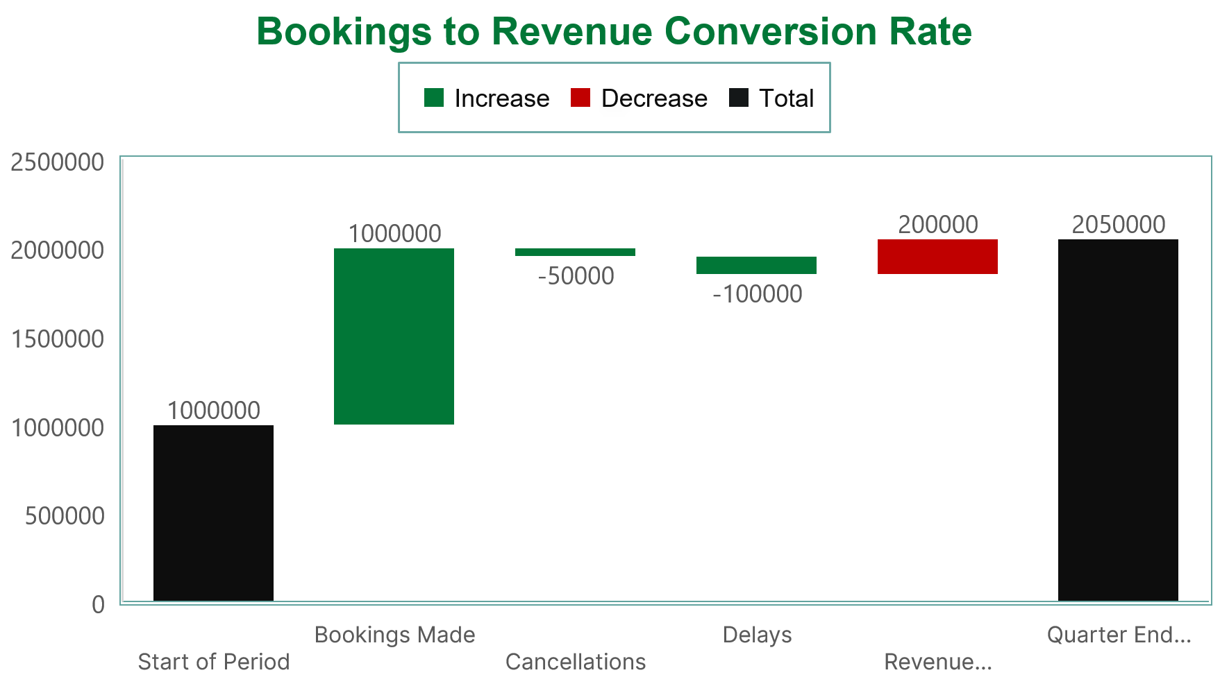
Bookings to revenue. See the impact of factors like cancellations, delays and payment models where revenue is recognized gradually (e.g., monthly or quarterly) on realized revenue from bookings.
A waterfall chart example in action
Let’s examine how a sales leader at an HR service agency might use the sales pipeline chart above to generate actionable insights.
The chart visualizes how the number of leads or deals at each sales funnel stage increased or decreased during a month.
Here are five possible insights and actions the sales leader could take from it.
Insight | Actions |
Improved volume of initial leads | Could reflect a successful change in approach to prospecting or marketing tactics. Share results with the marketing team to understand any new tactics or recently launched initiatives. Note what’s working for future campaign optimization. |
Reduced number of qualified leads | Could indicate that not all new leads are the right kind. Revisit how sales and marketing qualify leads and check they’re using prospecting techniques to attract your ideal customer. |
Improved number of proposals sent | Suggests the team does a good job of converting interest from qualified leads into serious consideration. Tell the team the positive news and invite them to share best practices. |
Reduced number of successful negotiations | Suggests the team may need to develop their sales negotiation skills and improve their ability to overcome sales objections. Discuss market conditions and industry trends with the team and consider introducing additional training. |
Improved closed rate | Suggests the team knows how to close a deal and perform well at this pipeline stage. Share the good news to boost morale within the sales teams. |
As this example demonstrates, a waterfall chart can offer sales leaders multiple insights to investigate, discuss and action with their teams and other stakeholders.
How to create a waterfall chart
If the insight you can gain from a waterfall chart sounds appealing, but you’re unsure about data visualization, the good news is that you don’t need to be a data expert to create one.
With the right data and software, it can be a simple task. The process involves two key steps: preparing and visualizing data with tools.
1. Prepare your data
The first step is to gather the data you need to create your waterfall chart. Depending on the type of insight you seek, this data might include conversions by deal stage, monthly or quarterly revenue, or subscriber numbers.
Whatever the scenario, the data you need will usually be available to export from your customer relationship management (CRM) software.
If you’re a Pipedrive customer, you may be able to skip this step. Data visualization software such as Plecto integrates with Pipedrive to automatically import your sales data and create waterfall and other chart types. Take a look at the options in the Pipedrive Marketplace.
Alternatively, you can export data from Pipedrive manually by:
Going to Tools and apps > Export data
Selecting the type of data you want to export and clicking on either “CSV” or “Excel”
Choosing the cloud icon in the “Available until” column to download the file
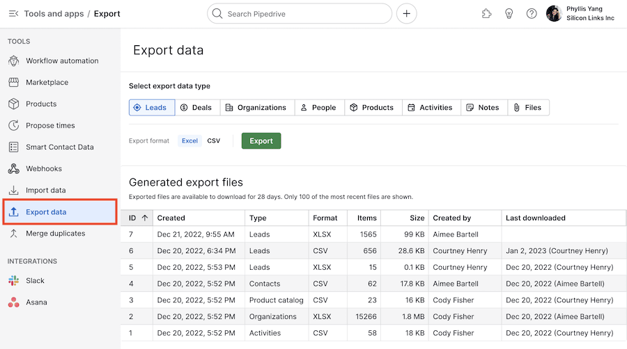
If you store your data in spreadsheets, you can also create waterfall charts with most tools, including Excel and Google Sheets. You can also export data from specific areas of Pipedrive to view in these external chart-building tools.
2. Use software to build your chart
You’ll need to use software to build your waterfall chart. Most people do this one of two ways:
By integrating their CRM with a data visualization tool to import their sales data and build their waterfall chart automatically
By exporting their data manually and uploading it to other chart-building software. Many custom platforms are available, although Excel, Google Sheets and Microsoft’s business intelligence platform PowerBI are popular options.
Whatever software you use, once you’ve entered your data, creating your chart should be a matter of a few simple clicks.
How to create a waterfall chart in Google Sheets
Here are the basic steps for creating a waterfall chart in Google Sheets with exported data from Pipedrive or another CRM.
Open Google Sheets
Go to File > Import
Go to Upload > Browse and select your exported data file
From the pop-up message in Google Sheets, choose “Import data”
Select “Open now” within the pop-up message to view your imported data in a new sheet
From there, go to Insert > Chart
It will display a chart automatically. Depending on your dataset, Google Sheets may use the waterfall chart format by default.
If the chart displays in a different format, open the “Chart type” drop-down menu from the “Chart editor” menu and choose the “Waterfall chart” option
You can use other options in the “Chart editor” menu to customize your chart view
How to create a waterfall chart in PowerBI
Here are the basic steps for creating a waterfall chart in PowerBI with exported data from Pipedrive or another CRM.
Select “Upload” at the top of your chosen workspace
Navigate to your exported data file and select it
On the “Data” pane, expand the “Sales” option
Select the “Total Sales Variance” checkbox
Choose “Waterfall chart” on the “Visualizations” pane to convert the visualization into a waterfall chart
To customize your view of the chart, use the other options in the “Data” pane
For more detailed step-by-step instructions, see Microsoft’s guidance for creating a waterfall chart in PowerBI.
Final thoughts
Data visualizations like waterfall charts can help you gain additional value from your sales data and develop a more nuanced understanding of your figures.
Having an at-a-glance view of the incremental changes contributing to an outcome can help with decision-making and communicating results to team members and other stakeholders.
Start by assessing whether a waterfall chart is the right tool for your project. Then, prepare the relevant data and create your chart to generate the clarity and insight you need to drive performance and improve sales outcomes.


