Welcome emails have the potential to make a huge difference to your customers’ experiences and their ongoing engagement with your brand.
If your first email to a new customer clearly shows value and guides them on what to do next, you can capture their interest early and start building a strong, lasting relationship.
In this article, you’ll discover effective welcome emails and a few key principles to help you grow a relationship with your new customers.
Why welcome emails are so important for SMBs
For SMBs, a strong welcome email series helps you build trust quickly, encourage early action and maximize the value of every new lead or customer.
A welcome email is sent to a new subscriber or customer after they’ve signed up for your email list. Your welcome email may be a one-off “thanks for signing up” email, or it can be the start of a longer onboarding email sequence after their first purchase.
While some businesses may use it simply as a confirmation email after someone fills out a signup form for a lead magnet, it can accomplish a lot more than that.
If you went to a brick-and-mortar store and made a purchase, the cashier would likely hand over your goods with a smile and ask if there was anything else they could help you with. They might point out how to get the most out of your purchase or suggest other relevant items.
Your welcome email is the digital equivalent of that interaction. It can enhance a customer’s experience.
11 of the best welcome email examples that get it right
The best welcome emails guide new users toward a clear first action while building trust and reinforcing the value of your product or service.
Here are eleven welcome email examples that get it right.
1. NeverBounce
NeverBounce is an email verification and list-cleaning platform that helps businesses improve deliverability and protect sender reputation.
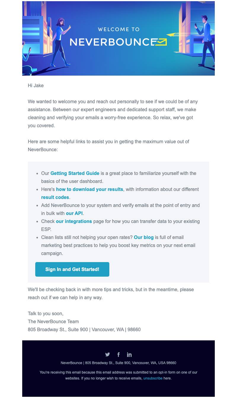
Welcome email breakdown
Sender name: NeverBounce
Subject line: Welcome to NeverBounce! How can we help?
Key components:
Support-led positioning. The email opens with a personal, service-oriented message: “We wanted to welcome you and reach out personally to see if we could be of any assistance.” Rather than pushing features immediately, NeverBounce frames itself as a partner. The tone is reassuring and customer-first.
Pain point acknowledgment. Email verification is often reactive. Users sign up because they’re experiencing poor open rates, high bounce rates or deliverability issues. The copy addresses the pain points indirectly by promising a “worry-free experience” and reminding users that they’re covered by expert engineers and support staff.
Resource-driven onboarding. Instead of a strict step-by-step checklist, the email provides a curated list of helpful links. This structure works well for a mixed audience where some users want a quick upload-and-clean workflow and others want API documentation.
NeverBounce’s welcome email feels practical and service-oriented. The SaaS welcome email example avoids hype and focuses on reliability and support, which fits a compliance-driven, technical product.
Unlike creativity or collaboration tools, the friction here is performance risk. Email deliverability affects revenue, making reassurance and clarity essential.
Takeaway: If your product solves a technical or performance issue, use your welcome email to position your team as a support partner. Clear resources and reassurance build trust early.
2. Hotjar
Hotjar is an analytics company that enables users to see how visitors interact with their website, with recordings, heatmaps, surveys and more.

Welcome email breakdown
Sender name: David from Hotjar
Subject line: Welcome to Hotjar 👋
Key components:
Highlighting a key benefit. The email opens with a greeting and reminds the reader of Hotjar’s value proposition: “seeing how people are really using your site”.
Next step details with CTA. The customer is then told what they need to do next: install the script on their site. After reminding them of their username, the sender gives the customer a nice, clear CTA button asking them to “Install Hotjar & Get Started”.
Support link. Finally, there’s a link to a step-by-step guide, along with an invitation explaining how to respond to the welcome email if the reader still has any questions.
This welcome email has one specific objective: to help users install the necessary script on their site.
Download Pipedrive’s general event checklist template
Playing around with scripts and codes on their website might seem scary to new customers, potentially putting them off before they even get a chance to try the product.
To prevent this fear, Hotjar stresses how simple it is, talking users through what they need to do and providing a step-by-step guide.
Takeaway: Make things easy for your new customers. If there are any potential obstacles to using your product successfully, address them head-on and explain clearly what needs to be done in your welcome email.
3. UsabilityHub
UsabilityHub is a testing platform that allows users to get feedback on website or web element designs, evaluating such features as ease of navigation and header clarity.

Welcome email breakdown
Sender name: Krystal from UsabilityHub
Subject line: 🎉Welcome to UsabilityHub
Key components:
Multiple CTAs for varying customer journeys. After a brief greeting, the email focuses on three common topics. Customers looking for inspiration are pointed to the example test gallery. Those who want to order responses from the panel get a link to a discount offer. Customers requiring vendor registration get a link to book a meeting with a named sales manager.
Support link. The email closes with an invitation to hit reply if the customer has any questions.
This is one of the shorter welcome messages, but it makes each word count. Rather than having one CTA, the email presents the most common requests and provides the necessary links.
In that same vein, UsabilityHub has chosen to wrap their entire welcome email in a LiveChat message design. This intentional welcome email design choice works to not only humanize the support person but also acts as a metaphor for the beginning of an open-ended conversation.
It’s a smart move that makes the new customer feel like they’ve been assigned a personal representative who’s there to take care of their needs.
Takeaway: Give new users the information they need. This welcome email sample shows that by talking with your existing customers and finding out what questions they had when they signed up, you can make your welcome email more relevant.
4. Experian
Experian is a consumer credit reporting company that collects and monitors credit details.

Welcome email breakdown
Sender name: Experian
Subject line: About your recent check of your Experian Credit Score
Key components:
Highlighting a key benefit. The email explains why the customer is getting this email and promises them that this is a great first step for anyone who wants to improve their finances.
Addresses potential pain points. Then Experian confirms that the report is always free and updated every 30 days, reassuring the customer that accessing their report won’t negatively impact their credit score.
Login CTA. There’s a clear CTA to log in to the free account.
Social links. The email then closes with links to Experian’s social media profiles.
Experian is one of the more traditional businesses in this list, so it’s no surprise that this welcome email is also more formal.
Emojis in welcome email subject lines wouldn’t really fit the Experian brand. Regardless, the email does a good job of reassuring new customers. Finances can be scary, so anyone who’s using the service will appreciate knowing that they won’t have to pay for the service and that it won’t hurt their credit score.
Takeaway: If there could be any fears or friction associated with using your service, use your welcome email to reassure new customers.
5. Scaleway
Scaleway is a European cloud provider offering infrastructure, compute and storage services for developers and growing businesses.
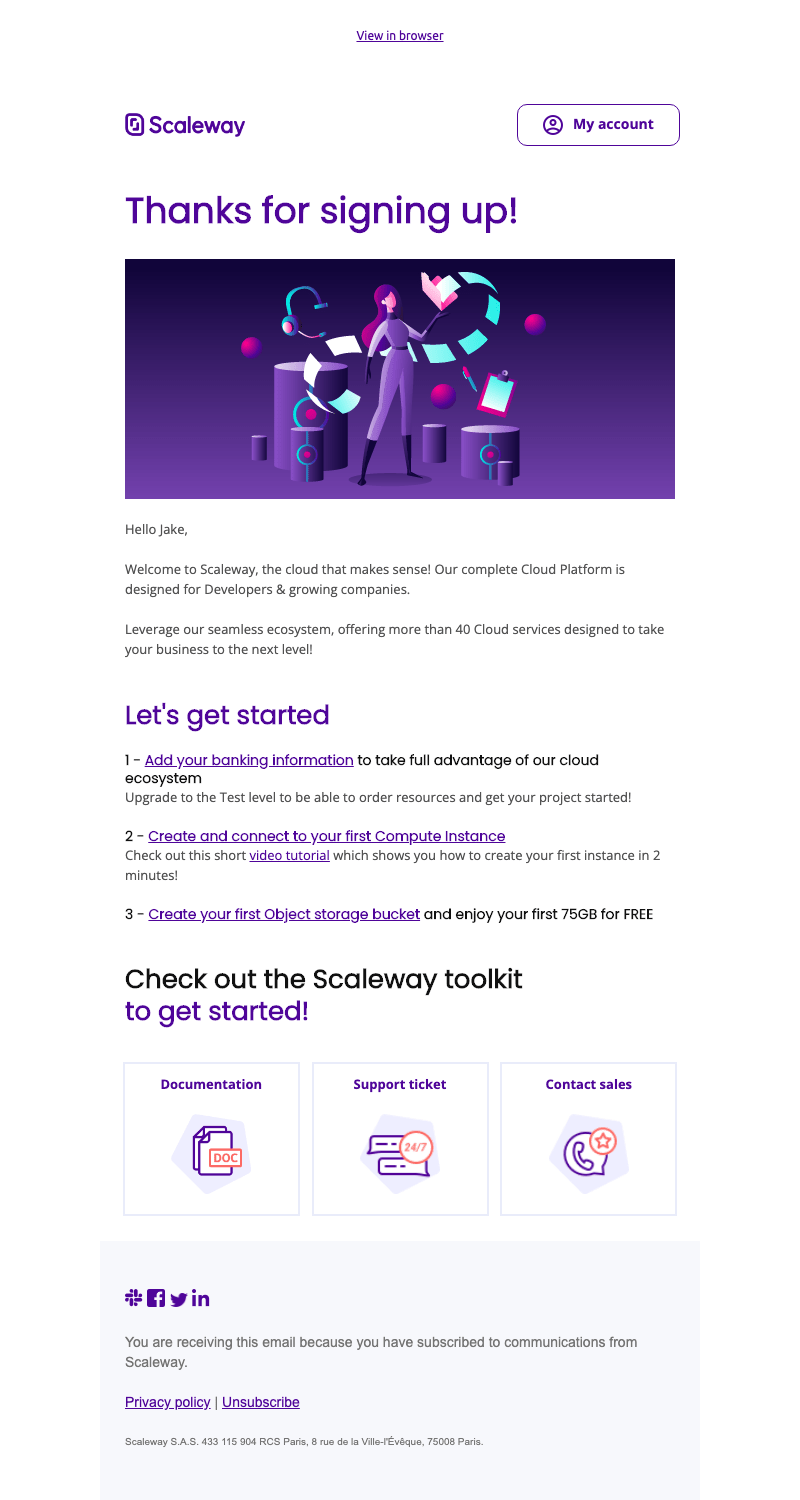
Welcome email breakdown
Sender name: Scaleway
Subject line: Here’s how to get started with Scaleway 🚀
Key components:
Clear onboarding steps. The email opens with a friendly “Welcome!” and quickly moves into a structured, manageable three-step setup process.
Strong focus on activation. Unlike more brand-heavy welcome emails, this one is action-oriented. The inclusion of a short video tutorial shows that Scaleway understands its audience: developers and technical teams who want to get up and running quickly.
Highlighting tangible value. The “75GB for FREE” storage callout makes the customer value immediate and measurable. For technical users, concrete specs matter more than abstract promises. Free usage lowers the barrier to testing the platform.
Multiple support touchpoints. Documentation, support tickets, contact sales and social links are all included at the bottom. This information reassures users that help is available, whether they’re self-serve developers or larger companies needing sales input.
Direct, product-led CTA. The primary call-to-action is “Let’s get started”, pushing users back into their account dashboard. The focus is clear – log in and build.
Scaleway’s tone is confident and practical. The rocket emoji in the subject line feels appropriate for a developer-focused cloud brand, signaling momentum and progress without undermining credibility.
Unlike finance or healthcare brands, cloud infrastructure doesn’t carry emotional fear in the same way. The friction here is complexity. Scaleway tackles that by simplifying the first steps and offering guidance.
Takeaway: If your product requires setup or configuration, use your welcome email to guide users through the first meaningful action. Early activation is more important than brand storytelling.
6. Fiverr
Freelance services marketplace Fiverr matches businesses with freelancers for a wide variety of services.

Welcome email breakdown
Sender name: Fiverr
Subject line: Welcome to Fiverr!
Key components:
Communal image. The email starts with a welcoming image, informing the customer that they’re now part of a “global community of doers”.
Brand USP. The opening paragraph reminds the customer of what they’re getting with Fiverr: a marketplace of freelancers who get the job done on time, on budget.
Compelling CTA. The CTA is compelling and written in the brand’s youthful tone of voice.
Popular services. The email goes on to highlight six of the most popular services available on the platform.
The opening encourages customers to think of themselves as part of a community, rather than simply being customers.
The CTA certainly stands out in this email. While it risks putting some people off, it also appeals to Fiverr’s target audience.
A Fiverr client doesn’t want to “sign in” or “get started”. They want to get stuff done. However, the email does lose points for coming from a “no-reply” address. It’s difficult to engage with someone if you can’t even reply to their emails.
Takeaway: Choose your CTA carefully. Think about what your new customers want to achieve and then give them the ability to do that, in the language that reflects their objectives.
7. Wistia
Wistia provides video marketing software for businesses, with hosting and marketing tools.

Welcome email breakdown
Sender name: Team Wistia
Subject line: Welcome to Wistia! 👋
Key components:
Celebratory image. The email opens with a parade of cute characters celebrating the customer’s sign-up.
Brand key selling point (KSP). In a short paragraph, the email reinforces what you can do with Wistia.
Compelling CTA. The email concludes with a CTA inviting the customer to visit their account page.
The parade makes a good first impression and acts as a warm welcome that raises a smile. The CTA is clear, leaving no doubt about what recipients should do next.
That said, the CTA is tied to a step, rather than an outcome. Something along the lines of “host your first video” could be more compelling.
Takeaway: Find a way to stand out in your customers’ inboxes when it’s your first time emailing them. The parade makes this email memorable, and if something’s memorable, then customers are more likely to act.
8. Notion
Notion is an all-in-one workspace for notes, tasks and wikis, with enough flexibility and features for you to set it up exactly the way you want it.

Welcome email breakdown
Sender name: Ivan at Notion
Subject line: Welcome to Notion
Key components:
Brand KSPs. After the greeting, Ivan explains that Notion comes with a lot of unusual features. To help the customer get started, the rest of the email serves as a quick walkthrough.
CTA to take immediate action. The email recommends following along with the walkthrough in Notion, with a CTA to “Go to Notion”.
Step-by-step guidance. The walkthrough is made up of five steps, each illustrated with GIFs.
Social media links and handy shortcuts. The guide concludes with a few handy links to shortcuts, mobile apps and their Twitter account.
Repeated CTA. The email concludes with another CTA button encouraging the reader to “Go to Notion”.
Notion is a great tool, but its versatility can make it overwhelming for new users. This great welcome email encourages you to follow along with the guide, so you’re actually setting up and familiarizing yourself with Notion as you go.
The guide starts with a simple first step (“start typing”) before working up to the potentially scary step of adding a database. The more complex step also includes links to additional helpful resources to make things easier.
Even though there are several links throughout the email, the formatting for the “Go to Notion” CTA button makes it stand out.
The email also makes great use of GIFs to illustrate the guide, making the whole process straightforward. This is the first email in Notion’s onboarding process, with future emails gradually introducing new features.
Takeaway: If your product or service is complex, use your welcome email to talk new customers through how to use it. Simple text, illustrated examples and links to additional resources help make potentially complicated steps simple.
9. Miro
Miro is an online collaborative whiteboard platform used by teams for brainstorming, planning, workshops and product development.
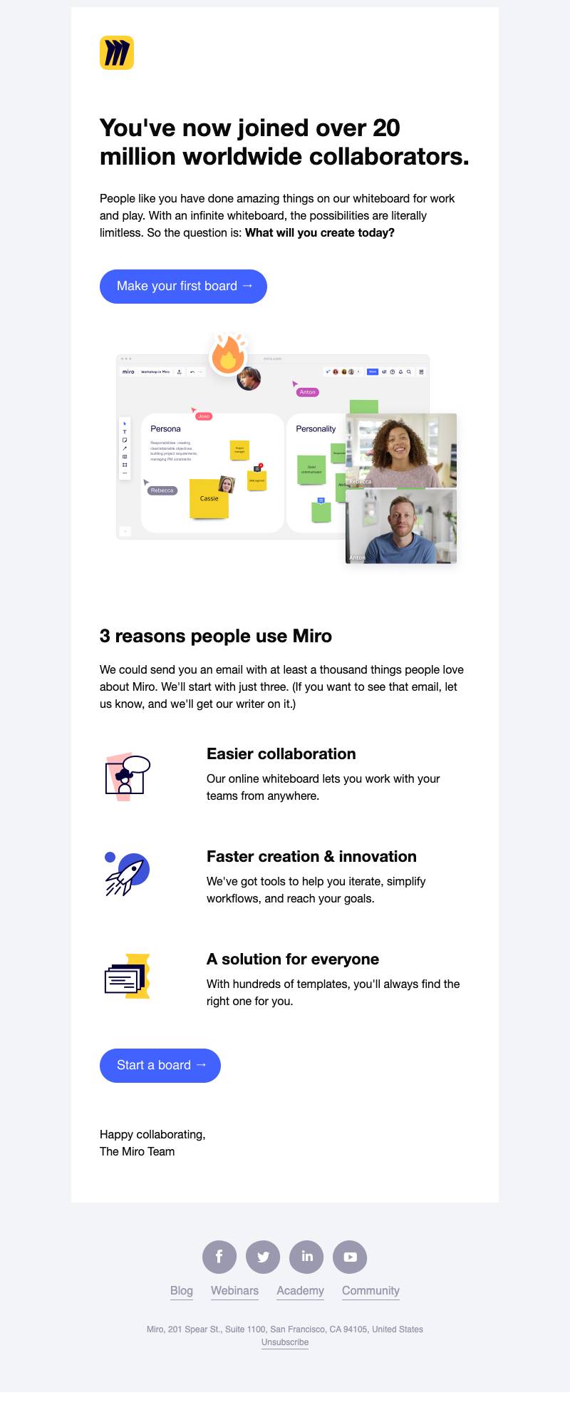
Welcome email breakdown
Sender name: The Miro Team
Subject line: Welcome to Miro. We’re Excited You’re Here.
Key components:
Social proof upfront. The email immediately highlights that the user has joined “over 20 million worldwide collaborators”. This positions Miro as trusted and widely adopted before explaining any features. For new users, that scale signals credibility.
Inspiration-driven messaging. Rather than focusing on setup steps, Miro leans into possibility: “With an infinite whiteboard, the possibilities are literally limitless. So the question is: What will you create today?” This question shifts the focus from the tool itself to the user’s creativity.
Clear primary CTA. The main button, “Make your first board”, pushes users toward one simple activation action. There’s no clutter, just start creating.
Benefit-led structure. Instead of listing features, Miro highlights “3 reasons people use Miro”. Each point ties back to outcomes, not technical specs. For example, “work with your teams from anywhere” speaks directly to remote and hybrid work realities.
Light, playful tone. The email copy includes a humorous aside about sending an email with “a thousand things people love about Miro”. This conversational tone makes the brand feel human and modern.
Learning ecosystem links. At the bottom, links to Blog, Webinars, Academy and Community extend the onboarding journey beyond the product itself. This supports long-term engagement, not just first use.
Miro’s welcome email is creative and community-focused. Unlike more technical SaaS platforms, Miro doesn’t need to overcome fear or complexity in this first touchpoint.
The email doesn’t overwhelm users with instructions. Instead, it builds excitement and nudges them toward their first action.
Takeaway: If your product is intuitive and creativity-driven, use your welcome email to inspire action rather than explain features. Focus on momentum and make the first step feel easy.
10. ProCook
Suppliers of everything you might need for your kitchen, ProCook sells its products in physical stores and online.

Welcome email breakdown
Sender name: ProCook
Subject line: Welcome to ProCook / Discount Info
Key components:
Appreciation. The email opens with a large illustrated thank you.
Important process information. After greeting the “Dear Valued Customer”, the email outlines clear expectations for what happens next regarding delivery information, reviews and offers.
Support link. The “P.S.” is used to give the customer care contact details.
Expert recommendations. The email recommends some additional products the customer might be interested in.
Brand KSPs. The email concludes by showcasing more of the brand’s details (free delivery, excellent reviews, number of customers, number of stores).
The email subject line uses the standard “Welcome to [Company]” but also mentions the discount code, something that’s likely to increase the average open rate.
If you’re selling a physical product that has to be delivered, customers will likely want to know what the process will look like. ProCook tells its customers exactly what to expect next, from the delivery of goods to the review request.
The personalized recommendations based on the customer’s initial purchases are another nice touch and an easy way to make more sales.
Takeaway: Prep your customers. They should never be left wondering what happens next.
11. Evernote
Evernote is one of the best-known note-taking apps, helping users organize their notes.

Welcome email breakdown
Sender name: Evernote
Subject line: Welcome to Evernote!
Key components:
Download CTAs. The email opens with links to download the app.
Specific feature callouts. It then goes on to describe two “bonus desktop moves for extra productivity”.
Upgrade CTAs. There’s a CTA for the customer to “Upgrade Now” to the premium version.
Repeated download CTAs. It concludes by again linking to the different mobile app stores where new customers can download the app.
The first email in Evernote’s welcome email series highlights the many possibilities this powerful tool offers users.
As the email doesn’t focus on a single feature, it promotes its perks depending on your needs. The email also highlights desktop add-ons for “extra productivity”, drawing attention to the various user experiences available.
Takeaway: You can use your onboarding email to list the various things that new customers can do with your app or product, and draw attention to certain features to encourage specific activities. Tie your features to the benefits that customers care about.
When should you send a welcome email?
Welcome emails should be sent immediately after a new subscriber signs up or a customer makes their first purchase to capture their attention while interest is high.
There are several types of welcome emails for new customers, from simple thank-you messages to more comprehensive onboarding sequences. Each type of email enhances engagement and sets the tone for a long-term customer relationship.
Depending on your business type, you could use the welcome email as an opportunity to encourage your new customers to:
Complete their profile
Set expectations for your service
Download or watch supportive content, such as a tutorial or FAQs
Log in to their account and take the next step, such as getting started with a SaaS tool or participating in an event
Provide more detailed information about themselves so that you can send them customized insights or opportunities
Get prepared for a follow-up in the next email with further instructions that will help them with their setup journey
Click on a CTA that brings them to a landing page to take further action
Make a purchase
With these types of emails, you’re also in a position to help recipients get the most out of their purchase and ensure they become satisfied customers.
Pro tip: It may seem counterintuitive, but it’s important to include an unsubscribe link in your welcome email. It’s required by law in many countries for GDPR compliance, and it makes it clear to your users that their involvement is optional and entirely up to them – helping to promote a reciprocal relationship.
Understanding and test-sending different types of welcome emails to new customers can also help you tailor your approach, ensuring your emails familiarize your new customers with your brand and get them excited about being a part of your community.
How to use Pipedrive to create a welcome email campaign
Use Pipedrive to automatically send personalized welcome emails when a new contact or deal is created, ensuring every lead gets a consistent first touch.
Pipedrive is a sales-focused CRM designed to help SMBs manage leads, track conversations and automate follow-ups. Here’s an example of the Pipedrive interface:
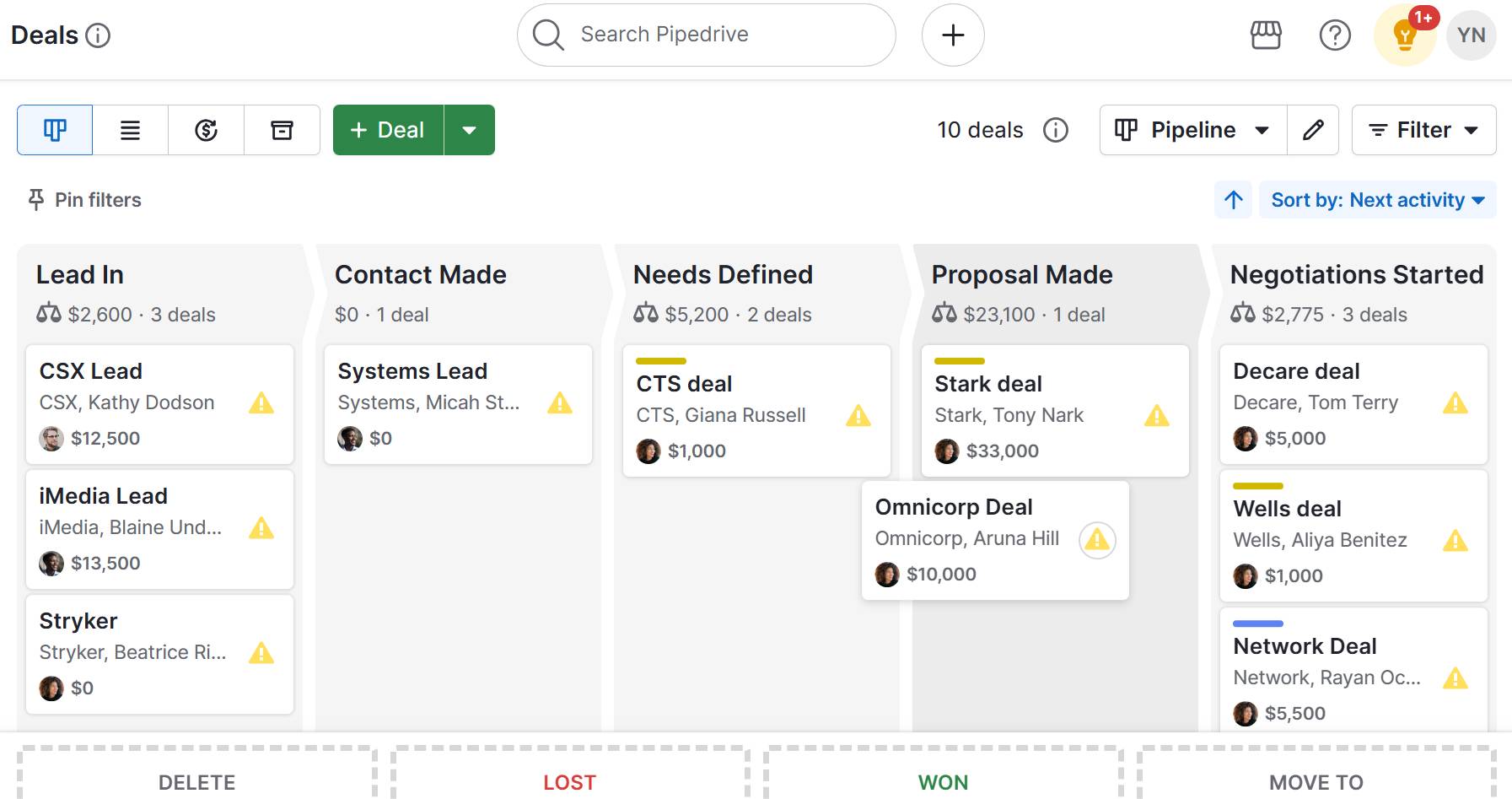
With its Campaigns add-on and automation features, you can create structured welcome email sequences and trigger them based on specific actions, like a new signup or deal stage change. Then, you can monitor engagement metrics such as opens, clicks and replies.
Take a look at some of the email data you can track in Pipedrive:
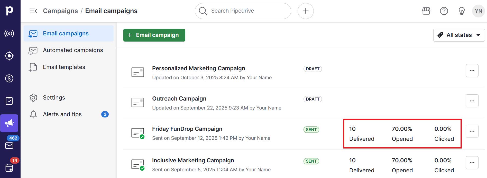
This functionality organizes your outreach and ensures no new contact slips through the cracks.
Here’s how to create a welcome email marketing campaign in Pipedrive:
Enable Campaigns. Make sure the Campaigns add-on is activated so you can build and send marketing emails.
Segment your audience. Create a filter for new contacts, for example, “Added in the last 7 days” or “Lead source = Website signup” to define who should receive your welcome email.
Create your welcome email template. Go to “Campaigns > Email templates” and design your welcome email. Use personalization fields like first name, company name or deal value to tailor the message.
Set up the email marketing automation. Use Workflow Automation to trigger the new campaign when a new contact is added, a deal is created or a specific label is applied.
Test before launching. Send test emails internally to check formatting, links and personalization fields.
Track performance. Monitor open rates, click-through rates and replies inside Pipedrive. Adjust subject lines, timing or content based on performance.
Using Pipedrive for welcome emails helps SMBs automate first impressions while keeping full visibility of every interaction in one place.
Pipedrive in action: Container Team used Pipedrive’s Campaigns and email automations to structure email communications and nurture leads through their sales pipeline. After adopting these features, the company saw a 15% increase in conversion rates and 18% year‑on‑year revenue growth.
Final thoughts
Welcome emails are an important part of your email marketing strategy. By exploring various types of welcome emails to new customers, you can find the most effective approach to engage your audience and encourage long-term loyalty.
Focus on what your new customers need and give them the know-how to get the most out of their purchase to increase satisfaction and encourage repeat purchases.
Use Pipedrive to simplify welcome email management. Automate sequences, track engagement and see measurable results like higher open rates. Sign up for a free 14-day trial to boost early customer activation.


